Why Your Airbnb Photos Aren't Getting Clicks (Even When They Look Great)
A guest scrolls through 47 listings in 90 seconds. Yours looks beautiful — professionally shot, well-lit, tastefully styled. But they scroll past. The issue isn't photo quality. It's where their eyes land first.
Most hosts obsess over brightness, angles, and décor. Almost none think about the psychological pathway a guest's eye takes across their photos — and that hidden hierarchy is quietly costing bookings. Understanding Airbnb photos eye movement psychology transforms a pretty gallery into a conversion engine.
This isn't guesswork. Eye-tracking studies and design psychology reveal exactly where guests look first, how long they linger, and what triggers the scroll-to-booking decision. Let's decode the visual journey your listing creates — and fix the invisible mistakes that kill click-through rates.
How Guests Actually Look at Airbnb Photos (The Science Behind the Scroll)
When a guest opens your listing, their eyes don't wander randomly. They follow a predictable pattern shaped by decades of web browsing behaviour.
Eye-tracking research shows most users scan images in an F-pattern or Z-pattern: top-left first, sweeping right, then diagonally down. On Airbnb, this means the top-left corner of your hero photo gets attention first — before the room type, before the title, sometimes before they even register the price.
Within 2-3 seconds, a guest decides whether to keep scrolling your gallery or close the tab. Their brain is asking: Does this look like the experience I imagined? If the visual hierarchy doesn't answer that question instantly, you've lost them.
Here's what guests fixate on first, in order:
- Focal points with high contrast — bright windows, statement furniture, bold feature walls
- Human-scale elements — beds, sofas, dining tables (subconsciously, they're imagining themselves there)
- Depth and perspective — wide-angle shots that show spatial flow attract longer gaze time than flat, head-on compositions
- Faces and figures — even a blurred silhouette in a photo pulls attention (which is why Airbnb discourages hosts from appearing in listing images)
If your hero photo is a bland hallway or an empty kitchen counter, you're asking guests to do cognitive work. They won't. They'll scroll to the next listing where the first image does the storytelling for them.
Want to see exactly where your listing stands? LetGrow's free listing score analyses your photo sequence, hierarchy, and visual flow against top-performing UK listings — and shows you precisely what to fix.
The 3-Second Rule: What Your Hero Photo Must Communicate Instantly
Your hero photo has one job: answer the guest's core desire in three seconds or less. Families want space and safety. Business travellers want calm and functionality. Couples want romance or style. Solo travellers want cosiness or character.
Most hosts choose their hero photo based on what they love about the space. Big mistake. The hero shot must reflect what your ideal guest is searching for — and that often means choosing the second or third-best photo by traditional real estate standards.
Here's how top-converting listings structure their hero image:
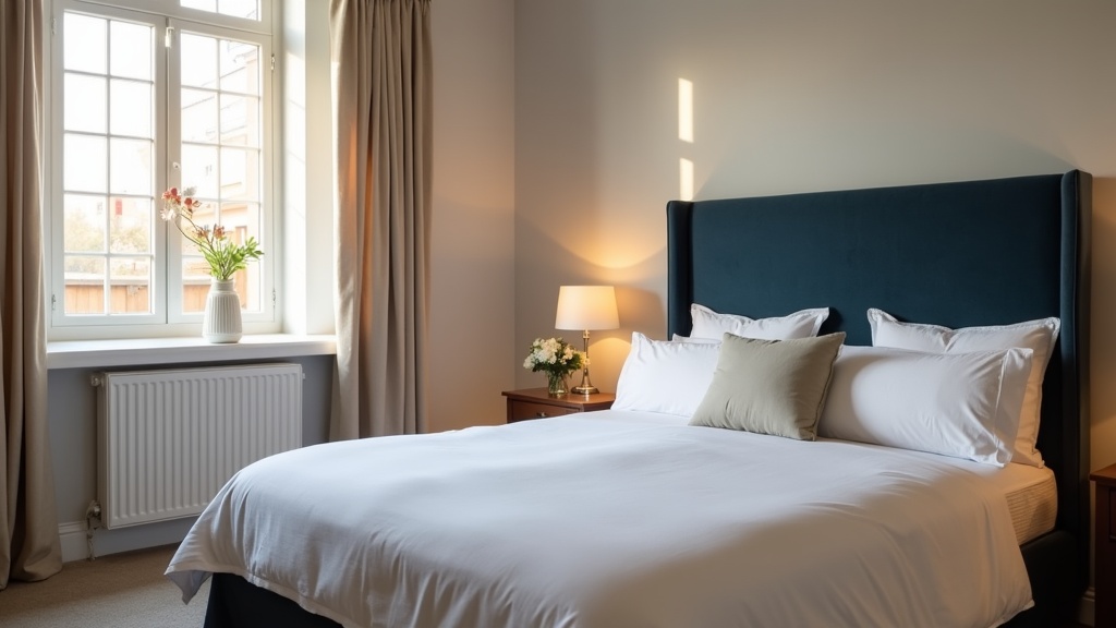
Show the 'Money Shot' — Not the Whole Property
A wide exterior shot says 'here's a building'. A close-up of a king-size bed framed by a statement headboard and soft linen says 'you'll sleep beautifully here'. Emotion beats information every time.
Use the Rule of Thirds for Visual Balance
Position your focal point — the bed, the sofa, the view through the window — along the intersecting thirds of the frame. Eyes naturally settle there. A centred composition feels static. Off-centre feels dynamic and professional.
Lead the Eye Toward Value, Not Clutter
If your hero photo includes a kitchenette, make sure the eye lands on the Nespresso machine or the marble worktop, not the bin or the plug sockets. Visual hierarchy isn't about what's in the frame — it's about what the brain prioritises within it.
A London studio with a beautiful sash window and city rooftops changed their hero from a full-room shot to a tight composition: foreground armchair, middle-ground desk setup, background window view. Bookings rose 19% in three weeks. Same property, same photos — different sequence.
Not sure which photo should lead? Our guide on choosing the one cover shot that wins the click walks through the decision framework used by top-converting UK listings.
Photo Layout Airbnb Listing: Sequence Is More Important Than Quality
You've nailed the hero. Now the guest scrolls. What they see in positions 2-5 determines whether they book or bounce.
Airbnb's gallery auto-plays as users swipe or click. Each photo is a micro-decision point: keep going, or try another listing? If your layout doesn't build narrative momentum, you lose them halfway through.
Position 2: Reinforce the Hero Promise
If your hero is the bedroom, position 2 should be the living space or the view — something that expands the story, not repeats it. Never put two near-identical angles back-to-back. It signals a lack of variety and kills scroll momentum.
Position 3-4: Showcase High-Value Amenities
This is where you convert the 'maybe' into a shortlist. Kitchen, bathroom, workspace, outdoor space, parking — whichever amenity your target guest values most. Families need to see the second bedroom. Business travellers need the desk and good lighting. Couples want the freestanding bath or the balcony with a view.
A Manchester two-bed flat was burying its private parking space at photo 18. Guests scrolling on mobile never reached it. The host moved parking to position 4. Enquiries from families and older guests doubled within a month. Parking isn't glamorous, but for the right guest, it's the deal-maker.
Position 5-8: Build Depth and Context
Now you can afford to show character details: the breakfast bar, the record player, the neighbourhood shot, the welcome basket. These images don't convert alone — but they deepen trust and desire in guests who've already been hooked by the first four.
For a full breakdown of the optimal photo sequence, see our guide on the photo order that stops guests scrolling past.
Guest Psychology Airbnb Photos: The Invisible Signals That Build Trust
Photos aren't just decoration. They're psychological proof that your listing is real, safe, and worth the price. Guests are subconsciously scanning for reassurance — or red flags.
Consistency Signals Honesty
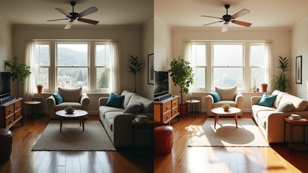
If your hero photo is bright and airy but the bathroom shot is dim and grainy, guests assume you're hiding something. Lighting, colour tone, and composition style should be consistent across the entire gallery. Inconsistent photos trigger distrust — even if every image is technically accurate.
Context Signals Value
A photo of a bed is just a bed. A photo of a bed with a tray of pastries, a folded throw, and a paperback on the nightstand is an experience. Small staged details — fresh flowers, a coffee cup, an open laptop — help guests visualise themselves in the space. That emotional projection is what converts browsers into bookers.
Negative Space Signals Calm
Cluttered photos make guests feel stressed. Clean sightlines, uncluttered surfaces, and intentional negative space communicate this is a place you can relax. Even if your space is small, thoughtful composition can create a sense of calm that oversized, chaotic listings can't.
One Bath studio host removed 40% of the visible décor before a reshoot — fewer cushions, fewer photos on the walls, fewer kitchen gadgets on display. Average booking length increased from 2.1 nights to 3.4 nights. Guests weren't booking for a longer stay — they were simply more confident the space would feel restful.
Visual Hierarchy Airbnb: How to Guide the Eye (and the Booking Decision)
Visual hierarchy is the art of controlling what guests notice first, second, and third. It's why some listings feel 'premium' even at mid-market prices — and why others feel chaotic despite expensive furniture.
Use Leading Lines to Direct Attention
Floorboards, hallway walls, kitchen counters, bed frames — all create natural lines that guide the eye. Shoot along these lines, not across them. A photo taken from the bedroom doorway looking toward the window pulls the eye through the space. A photo taken from the side, cutting across the bed, stops the eye dead.
Contrast Creates Focal Points
The eye is drawn to contrast: light against dark, colour against neutral, texture against smooth. If your hero photo has a dark velvet headboard against white linen, that's your focal point. If everything is mid-tone beige, there's no hierarchy — and the brain has to work harder to find meaning.
Foreground-Middleground-Background Builds Depth
Flat, straight-on photos feel lifeless. Layer your composition: a plant in the foreground, the sofa in the middle, a piece of art on the far wall. This depth mimics how we see in real life and makes digital photos feel tangible and inviting.
A Brighton seafront flat added a simple vase of flowers in the foreground of their living room shot. Same room, same angle, one small addition. Time-on-listing increased by 34 seconds — long enough for guests to scroll the full gallery and read the description.
If you're wondering whether your current photo hierarchy is working, LetGrow's free performance score reviews your visual flow and identifies which images are helping — and which are costing you bookings.
Mobile vs Desktop: Why Your Photo Layout Needs to Work on a 6-Inch Screen
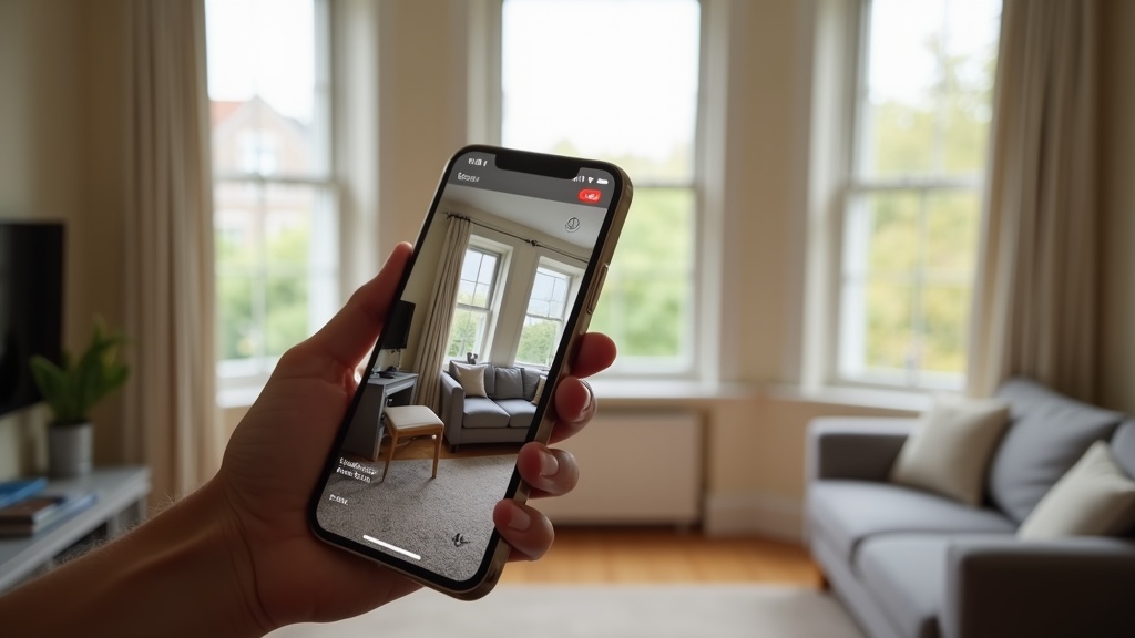
Over 60% of Airbnb searches happen on mobile. Your carefully composed wide-angle shots are being viewed on a screen the size of a postcard. If your visual hierarchy doesn't work at thumbnail scale, you're invisible to the majority of your audience.
Test Every Photo at Mobile Size
Open your listing on your phone. Scroll through. Can you instantly tell what each photo shows, or do you have to squint and zoom? If you can't identify the subject in under a second, neither can a guest.
Avoid Wide Shots That Lose Detail
A sweeping panorama of your open-plan living-kitchen-dining room looks stunning on desktop. On mobile, it's a blurry smudge. Tight, well-composed shots with clear focal points perform better on small screens.
Prioritise Vertical and Square Crops
Horizontal photos get letterboxed on mobile, wasting precious screen space. Vertical or square compositions fill the frame and hold attention longer. If you're shooting new photos, frame for mobile first — you can always crop wider for desktop later.
For more mobile-specific advice, our guide on photo optimisation tips without hiring a photographer includes a full section on shooting for smartphone-first browsing.
Common Photo Psychology Mistakes That Kill Bookings (and How to Fix Them)
Even experienced hosts make these visual hierarchy errors. The good news: they're all fixable without reshooting.
Mistake 1: Burying Your Best Asset
Your listing has a stunning original fireplace, a private garden, or a roll-top bath — but it's buried at photo 12. Guests don't scroll that far. Move standout features into the top five. If it's a booking trigger, it belongs in the first act.
Mistake 2: Too Many Similar Angles
Four photos of the bedroom from slightly different corners don't add value — they add fatigue. One great shot per room is better than three mediocre ones. Use the saved slots to show amenities, neighbourhood context, or unique details.
Mistake 3: Ignoring the Emotional Arc
Your photo sequence should tell a story: arrival, relaxation, living, sleeping, convenience. A random jumble — bathroom, exterior, bedroom, kitchen, sofa, front door — forces the guest to do mental work. Cognitive load kills conversions.
Mistake 4: Forgetting the 'Why Book This?' Shot
Every listing needs one image that answers: why this property and not the 40 others I've just scrolled past? It might be the view, the location, the style, the space, or a quirky original feature. If that photo isn't in your top three, you're hoping guests will dig for your USP. They won't.
A Cotswolds cottage had beautiful interiors but was losing bookings to nearby competitors. The host added a golden-hour shot of the stone exterior with wisteria in bloom — and moved it to position 2. Bookings from London guests increased 27% in six weeks. That one image communicated 'English countryside escape' more powerfully than a dozen interior shots ever could.
How to Audit Your Own Photo Hierarchy (Step-by-Step)
You don't need a degree in psychology to apply these principles. Here's a practical five-minute audit you can run right now:
Step 1: View Your Listing Anonymously
Open an incognito browser window and search for your property as a guest would. First impressions only happen once — this is your chance to experience your listing with fresh eyes.
Step 2: Time Your Reaction to Each Photo
Scroll through your gallery and note which images make you pause, and which you skip. Guests do the same thing, only faster. If you're bored by photo 6, so are they.
Step 3: Identify Your Focal Point in Each Image
Where does your eye land first? Is that the element you want to highlight? If your eye goes to the radiator instead of the bed, the composition needs work.
Step 4: Check for Visual Consistency
Do all your photos look like they belong to the same property? Consistent lighting, colour balance, and style signal professionalism. Mismatched photos — one sunny, one overcast, one with a warm filter, one cool-toned — signal amateur hour.
Step 5: Compare Against Top Local Competitors
Search your location and dates. Open the top three listings. How does your photo sequence compare? Are they leading with a hero shot that immediately communicates value? Are they showcasing amenities you've buried? Learn from what's working.
If you'd rather have an expert handle the analysis, LetGrow's free listing score benchmarks your photos against high-performing UK listings and gives you a prioritised action plan — no guesswork required.
Quick Wins: 5 Changes You Can Make Today to Improve Visual Hierarchy
You don't need a reshoot to see results. These tactical tweaks take minutes and can shift your conversion rate within days:
- Reorder your gallery — Move your most emotionally engaging photo to position 1. Move high-value amenities (parking, workspace, garden, view) into positions 2-5. Bury duplicate angles and low-impact shots at the end.
- Delete weak photos — If an image doesn't add new information or emotion, remove it. A tight 12-photo gallery beats a sprawling 30-photo mess every time.
- Crop for mobile — Zoom in on key details. A close-up of your coffee station or a beautifully made bed works better on a small screen than a wide shot of the whole kitchen.
- Add captions to guide attention — Airbnb lets you caption each photo. Use this to direct the eye: 'King-size bed with hotel-quality linen', 'Private parking space included', 'Original Victorian fireplace'. Captions reduce cognitive load and improve comprehension.
- Test a new hero image — Swap your current hero with your second or third photo for one week. Track views and booking requests. Sometimes a small change in visual hierarchy delivers outsized results.
One Edinburgh host reordered their gallery using these principles — no new photos, just a smarter sequence. Click-through rate from search results to full listing increased by 22% in ten days. That's the power of understanding how guests actually look at your photos.
When to Reshoot vs When to Reorder
Not every listing needs new photography. Sometimes the issue is sequence, not quality. Here's how to tell the difference:
Reorder If:
- Your photos are well-lit and sharp, but your hero doesn't reflect your target guest's priorities
- High-value amenities (parking, garden, workspace, view) are buried beyond photo 8
- You have strong images but they're presented in a confusing or repetitive order
- Your time-on-listing is low but your photos themselves look professional
Reshoot If:
- Your photos are dark, blurry, or shot on an outdated phone camera
- Your rooms look cluttered, dated, or uninviting
- You're missing key shots (bathroom, kitchen, bedroom close-ups, exterior, amenities)
- Your lighting is inconsistent — some photos bright, some murky
If you're on the fence, our comparison guide on smartphone vs professional photography helps you decide whether a DIY reshoot is enough or whether it's time to invest in a pro.
And if you're planning a reshoot, make sure you understand what to shoot and why before you start. LetGrow's £9 optimisation guidebook includes a shot-by-shot checklist tailored to different property types — so you never waste time (or money) on photos that don't convert.
Bringing It All Together: The Psychology-Led Photo Strategy
Your photos aren't just a gallery. They're a conversion funnel. Every image is a decision point. Every sequence choice either builds momentum toward booking or leaks attention to a competitor.
Understanding Airbnb photos eye movement psychology means designing your listing for how guests actually browse — not how you wish they would. It means choosing images that answer emotional questions in seconds, not minutes. It means building visual hierarchy that does the cognitive work for tired, distracted, overwhelmed travellers scrolling through dozens of tabs.
The best part? These principles cost nothing to apply. You don't need expensive software, a design degree, or a professional photographer. You need awareness of where the eye lands, what builds trust, and how to structure a visual narrative that converts.
Start with your hero. Audit your sequence. Cut the clutter. Prioritise emotion over information. Test, measure, and refine.
Ready to see how your listing measures up? Get your free performance score at LetGrow and discover exactly where your photos are winning — and where they're quietly losing you bookings.